Wednesday, 27 April 2011

The specs ...

Ok, so let's get down to the nitty gritty ...

Although we have still got a loooong way to go in terms of making final decisions on all the inclusions, I figured I'd at least start this post and then add to it as we cross things off the list.  That way it won't be such a big job to do later on down the track - and I'm less likely to forget something (not that it really matters I guess).

EXTERIOR selections ...


Bristile | "Traditional" profile | colour "Magnum"


Austral Bricks | "Elements" series | colour "Graphite"  

Austral Bricks | "Elements" series | colour "Graphite"
(shown here with charcoal mortar - as we've selected)


Colourbond "Woodland Grey"
... aluminium windows & doors powdercoat colour

Colourbond "Monument"
... used for gutters, flat roof and staircase steel stringer


INTERIOR selections ...


Shoji Screens | "Hikone" design | sliding door
... for study/guest room


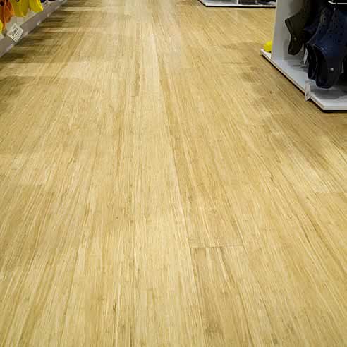
bamboo flooring | strand woven | "natural" colour
... for throughout house except bedroom and wet areas


Caroma Wall Faced Invisi Series II


"Icon" sliding door handle
... for master bedroom balcony


"Icon" bi-fold door operator
... for open plan living area


"Icon" hinged door lock
... for kitchen French doors


"Icon" casement latch
... for all other windows


either this ...
Gainsborough "Senator"
lever passage set


or this ...
Gainsborough "Senator"
lever passage set


Dulux "Mangrove Leaf"
... for glass splashback


Our overall colour scheme - including our inspiration ...

One of the very first things we did when we realised we'd be building our house from scratch (ie. it quickly became apparent we'd have to go custom build because our land was simply too small to fit an existing floorplan from any of the volume builders) was to consider both the general look, as well as the overall colour scheme, of the house we wanted.

In my previous post you will find pics which show examples of some of the various inclusions or features we're hoping to have in our house - which I think gives a good overall reflection of the clean, contemporary look we're trying to achieve.

This post, on the other hand, covers some of the considerations that happened before that - looking at the colours, textures and materials that I find that I'm most drawn to!


what I love ...

Basically, when it came to deciding on a colour scheme for our new house it was pretty easy.  Whilst in a way it might've been nice to reinvent myself a bit and try out new things, I just really couldn't go past the colours and tones that already make up my current surroundings.

I love nature and have always tried to surround myself with plenty of greenery. I don't doubt at all that my Mum's love of gardening has been an enormous influence on me.  Ooooh, I really can't wait to create a garden in our new place! I've never ever had one before - just LOTS of indoor plants and potted plants out on the balcony (can you believe, in our small 2-bedroom apartment there are 16 plants inside and 18 plants outside, plus a water bowl ... but that's only because we're lucky to have TWO balconies!)

Why so many? For me, aside from injecting some life into a home - making it feel fresh and alive (and if I'm not mistaken, I believe it's also good feng shui) - I  basically just adore the shapes of the foliage. At night especially, each plant I own has it's own beautiful and unique form that creates stunning silhouettes and shadows on the ceiling and walls. So it really makes for a nice atmosphere - whilst also cleansing the air!

So yeah, anyway ... for that reason, it was certainly a must to include some fresh GREEN into our colour scheme.

The rest of the colours we have chosen are also fairly natural ... dark and medium GREY, dark BROWN, as well as BLONDE wood and WHITE to counter-balance these darker tones.

Here are some pics I took out and about when we were first started to consider building our house. Aside from the colours I've mentioned they also show the textures we are keen on: a mixture of 'hard' materials such as stone, concrete render, metal and glass, with timber and green plantings to soften the look.


and yet, I don't at all love this ...

Funnily enough, however, I've noticed that whilst some places we've seen have in fact adopted the basic colour scheme we've chosen (ie. green, white, grey and brown), the end product of that combination doesn't always work for me.  

The example below, for instance, does not at all tickle my fancy.  Too flat, I think ... a definite lack of warmth or real interest - perhaps it's just a bit too masculine or something.  Dunno, I'm no expert on these things - I just know what I like and don't like ... and this definitely falls into the latter!  


what colours are going where ...

dark and mid GREY tones
  • brickwork for ground floor, including garage
  • concrete render to 1st floor and porch
  • bathroom floor and wall tiles
  • laundry floor tiles
  • carpet (study and bedrooms only)
  • balcony tiles
  • roof tiles
  • outdoor paving
  • driveway (perhaps)
  • aluminium windows
  • guttering, downpipes etc


 WHITE accents
  • stone bench tops in kitchen, powder room, bathroom, ensuite and laundry
  • tiled splashback in laundry
  • laminate for upper kitchen cabinets
  • laminate for lower living room in-built cabinet
  • ceiling and wall paint throughout
  • 1st floor concrete render 
  • garage door (perhaps - or otherwise an almost white VERY pale grey)


a splash of GREEN for colour 
  • glass kitchen splashback
  • perhaps a feature wall to downstairs study/sitting room/guest room* 
  • perhaps a feature wall upstairs somewhere, either in the landing area OR in the master bedroom

* ie the downstairs "study" is not really a study at all ... it will basically just be an additional room to sit in, read the paper and lazily soak up the sun (it's north facing) - and, when needed, it will act as a guest room (with an attached 'ensuite' - as the powder room has two entrances)

dark chocolate 
  • woodstain to front door
  • treads to stairway
  • timber lattice on the "Shoji Screen" sliding door to study
  • timber treads to staircase
  • laminate to lower kitchen cabinets
  • laminate to front of island kitchen bench
  • laminate to upper living room in-built cabinet
  • laminate to bathroom cabinets


blonde wood
  • bamboo flooring throughout (except bedrooms and wet areas)


Tuesday, 26 April 2011

The look we hope to achieve ... imagination vs reality!

Imagination is a funny thing.  Just like seeing a film after reading the book, or meeting someone face to face with whom you've only ever spoken to on the phone, the images we conjure up in our head rarely correspond to reality.

And this can often - though not always - lead to disappointment.  In which case, I guess one can only hope that such disappointment is mild enough to be soon forgotten once our eyes become accustomed to what we're actually looking at, rather than remembering the ideal that was merely a product of our imagination.

Why do I mention this? Well, because for just short of two years now I have been trying to imagine myself in my new home.  I've been staring at our plans on paper for far too long, seen too many display homes, showrooms, real estate listings and magazine and web pages that my sense of what's actually achievable, rather than simply what's beautiful, has been all messed up!

It's the first time I'll have ever lived in a place that was entirely of our own creation - not just the decor, but everything!!! So naturally, once you dive into a project like building a house it's all too easy to let your imagination run wild - and way off course - not to mention becoming completely obsessive over such seemingly small things you would most certainly never otherwise notice. I mean, who knew one could actually get excited about toilet cisterns (or in our case, the lack thereof) and kitchen sinks - or even window frames and downpipe colours! Of course, for the most part it's been a fun and exciting experience (so far) ... but at the same time, it's a very VERY daunting and nerve-wracking one too.

You see, unlike moving into an established house where you can blame whatever faults there may be (eg. that shonky renovation, bad tiling, concrete backyard or those dark poky rooms or whatever) on some previous owner or landlord, there are no excuses you can hide behind or someone else to blame in terms of anything that might be dated or wrong - or just plain ugly - when the house you're moving into is brand-new and custom-built. A new and custom-built house is all about YOU! And whilst that might be great in theory, it's a thought that makes me tremble with fear and trepidation.

Sure, to some degree there are always going to be limitations (for us to be able to point the finger) within which we all have to work - eg. to do with the site, the orientation and the size of the land you have; and of course let's not forget budget limitations which will affect everything from the layout and size of your house, right down to the types of fixtures and decor you can afford .  This inevitably - and invariably - leads to compromise; some big and some small.  So, in my case it's bye-bye spectacular void (in addition to perhaps a small handful of other things which I've already forgotten about since making those compromises).

Of course, I try and remind and reassure myself that one can't expect to have (nor is it even good to have) everything one's heart desires ... Besides, if I think about it, I've never actually seen - outside of display homes and glossy magazines - a REAL person living with an expansive void towering above their heads!! ... so I'll try not to feel too hard done by with that wish-list item not having been met.

Which means, I guess my need to inject a bit of drama and atmosphere will have to come from something, and someplace, else ... Humph, if I'm really lucky, I might find just the right thing in Ikea (?!?!) or better yet, more likely from one of those fab vintage and/or industrial stores, which I love to explore. Who knows, if I'm feeling a bit creative, possibly even Spotlight or Lincraft - but I doubt it!

Ok, so then in terms of the overall look we are hoping to achieve (ie.the one that is still in our heads, yet to be realised) I guess you'd describe it as ... contemporary, with clean lines.  Certainly not 'hard' or cutting-edge modern. Just a regular, very liveable, and everyday kinda modern, which - down the track - I hope to be able to add my own flair and personality quirks to. Hopefully, too, it will look a bit fresh and crisp, and light and airy (this will be a bit of a challenge, given the back part of the house, which is where the main living and kitchen is, faces south) ... and, ideally, I suppose a little bit sophisticated also.  Gosh, this is all starting to sound a bit wanky isn't it! Sorry.

Like I said, imagination is one thing ... Only time will tell if all this eventuates.

Meanwhile, so this post has at least a few nice pictures to look at - and not just my late night rambling musings - here are some shots of various interiors and exteriors that have caught my eye, captured my imagination and sparked some inspiration (mostly of houses, but with the odd building, cafe and even office, thrown in for good measure). Hopefully as a collection they offer a glimpse into the sort of look we're going for.

Sunday, 24 April 2011

My grey matter hurts!

Ay, ay, ay ....


You would think that having long ago come up with the overall colour scheme for our house (charcoal grey and white, with the occasional splash of green for interest ... and also timber and timber-look features for warmth), it wouldn't be so hard coming up with the external render colours.

But alas, the process is not so easy after all.  And although, IN THEORY, if I do happen to make a "monumental" mistake (excuse the pun) it's not as if we couldn't just repaint it if the poor colour selection bothered us that much, who really wants to spend more money on that when already the odd upgrade here and there is already beginning to hurt the hip pocket! And - mind you - that's even before thinking about all the additional furnishings and light fittings, furniture and landscaping that needs to be done!!

Humph, I dunno why I'm putting the additional pressure on myself in wanting to have a fab house all ready in time for our baby's 1st birthday ... but I guess it's nice to at least aim for certain goals and timeframes, lest we don't end up living with packing boxes strewn about the place for months on end. But (typically), I once again digress ...

Back to why my grey matter hurts!

Thankfully, of all the various grey paint colour swatches I've collected along the way, I've managed to eliminate all the colours that are no longer in contention!

Our builder suggested that for external rendering, we stick to one particular leading brand name paint, so that recommendation alone was of enormous helping in creating a shortlist.

Next, taking advantage of the full sun a couple of weeks ago (as opposed to trying to pick out colours in dimmed lighting), I grabbed all the swatches and one by one held them up to the light and divided them into "definitely no" and "maybe" piles.  So, out went everything with purple and mauve tints to them (yuk!) and also all those 'cool' coloured greys, with blueish undertones.

So, whilst the absolute final selections are yet to be determined, here is the shortlist of "maybes" ...


The short-list for external paint colours (ie. for all render work) ...


--
DARK GREY TONES ...

Domino.

--
MEDIUM GREY TONES ...

Raku.
Malay Grey.
Stepney.

Western Myall.
Teahouse.
Timeless Grey.

--
LIGHT GREY TONES ...

Flooded Gum.
Silkwort.
Dieskau.


Stay tuned for final selections ... shortly, I hope!

Next steps ...

Next steps (for the builder) ...

We're waiting for the front door frame to be done, so that the rest of the brickwork (downstairs only) can be done. Then, I guess, it's upstairs cladding (in polystyrene, to be later rendered). Followed by the roof tiles, I presume. And then - once all the windows are completely done - that should hopefully take us to lock up stage.

Next steps (for us) ...

BATHROOM CHOICES

At the very least, I think we need to confirm our choice of shower mixer. Toilets have already been selected (Caroma Cube Wall Faced Invisi II) and I believe the specifics for the rest of the bathroom fittings can wait a tiny bit longer.  Hopefully. We pretty much know what we're after (ie. gooseneck mixers for the basin; square or rectangular basins - just not sure if inset or above-counter; island bathtub - preferably double-sided), but for some reason we just haven't got around to making firm and final decisions on the actual specs. Procrastinating?!? Probably.

EXTERIOR COLOUR SELECTIONS

More pressing - I think - is trying to work out the render colours.  But again - hopefully - we can buy some time and wait for it to be actually plastered.  I'm kinda hoping once I see it in real life, from all angles, I'll somehow magically find inspiration and insight into which shades of grey (and possibly white or off-white) is to go where.  At least I pray that's what'll happen!


Where we're at so far ...


In a nutshell, at the time of commencing this blog (23 April 2011), this is where we're at ...

The slab has been poured.

Brickwork to the garage is complete (although some minor rectification is yet to be done to the front, near the porch). Brick wall adjoining neighbour's house also complete.

Frame is up.

Windows have mostly been installed (although some of the actual glazing has yet to be completed - and we are still waiting for the ensuite highlight window and balcony sliding door to arrive).

Initial plumbing has been fitted, together with gas.

--
Here's a quick look at what's been done so far ...


From August 2009 until December 2010 the site of our future home looked like this, sad and forlorn.


Then finally by mid-December 2010 we had cyclone fencing and a concrete slab foundation.
It's funny how one can get so excited by concrete - but at last we could get a sense of how big our house would be (especially as some initial work had also been done measuring and drawing in lines to show where the walls are to go).


But following the initial excitement of construction commencing, the Christmas/New Year lull followed.
It wasn't until mid-February 2011 that we noticed bricks had arrived on site.


By early March 2011 there was sand for the mortar.
And if you look very closely, you'll see we have our very first wall (adjoining our neighbour's house), where some mortar colour testing was done.


Next came the garage brickwork around mid-March 2011.
Finally we get to see how the bricks and mortar look together.  Thankfully we were pleased with the result.


About a week later (18 March 2011) the downstairs frame was complete.


By early April 2011 the upstairs frame had been done, including the roof trusses.

It was fantastic to actually see the plans come to life, and to be able to view the house from various angles - inside and out.  After only ever seeing 2-D floorplans and elevations for so long (almost a year and a half), at last we can now see the full shape of our house.


Mid-April 2011 the windows were installed - well most of them.

Rather surprisingly, it was quite satisfying seeing the windows in place.  So instead of just seeing large square-ish holes in the walls, the house now has more of the narrow rectangular shapes I was keen to incorporate into the design.

Up until this point I had been "somewhat"(?!?) obsessing about window sizes (450mm vs 670mm widths) - even to the extent of pulling out my measuring tape (which I now take with me wherever I go - sad, but true!) and checking the sizes of random people's windows that I passed by.

I was also rather impatient to see how well our colour selection would blend in with the brickwork.  Although we have yet to actually see how the bricks will look alongside the windows as such, I am now a bit more quietly confident about how these two elements will both work together.

Oh, and the latches on all the casement windows don't at all look as "busy" and cluttered as I had imagined.  Phew!


Early May 2011
Prep work done in readiness for downstairs brickwork
and remaining window frames (eg. ensuite) installed.


Mid-May 2011
Downstairs brickwork complete ... so excited about having a front porch!  It's nice and wide to accommodate me and all the many bags I carry these days, plus of course the SUV-sized pram ;)   And I'm relieved to see just how well the window colour blends in with the brickwork.

Oh, and we now also have a roof - well, most of it.  Roof tiles done - flat metal roof  still outstanding
(eg. over the garage, porch and al fresco).  Again, happy to see that so far our colour selections for this (ie. "Magnum" roof tiles and "Monument" fascia and gutters) work well.


2 June 2011
... After much rain, little has been done - but at least the site has been cleaned up.

Naturally, the portaloo remains, but gone is the large pile of sand, the broken and excess bricks, as well as other rubbish from the front.  Backyard has yet to be cleared up, as it was too muddy for the bobcat to enter that far onto the site.


4 June 2011
... Different angle to show that two days later we have a flat roof over the garage and kitchen.


4 June 2011
- From a bit further away you can better see how both the new flat roof
as well as the regular roof tiles actually look like.


11 June 2011
... Cladding in place upstairs (in readiness for render work).
Remaining glazing has also been installed (ie. prior to now, many of the windows didn't actually have glass in the frames - something to do with the heaviness of them.

The bricks have also been cleaned (twice, but ever so lightly - so as not to remove the face colour).


30 June 2011: Polystyrene walls in place, with cement currently being laid over the top.


2 July 2011 ... Voila! the "finished" product ... ready for painting.
If we didn't know better, now that the porch has been cemented over, the exterior of the house looks almost as though
it's actually finished.


2 July 2011 ... from side angle


2 July 2011 ... Hooray, we have posts for the alfresco area!  Can't wait for warm Summer nights.


23 July 2011 - Spot the difference ... (aside from more rubbish) ... we have our garage door (Colourbond "Surfmist").


14 July 2011 ...  External paintwork has begun (side of house and ensuite, plus porch and alfresco posts).


Hmmmm, not sure about the Woodland Grey.  In a way, it's looking really dark (so thank goodness I didn't opt for anything darker) and a bit green (although we knew Woodland "Grey" is a browny-greeny-grey colour).  Well .... at least it blends in nicely with the windows.  Hope it looks ok when all completely done - and better yet once it fades somewhat ... AND we have a garden to detract from possibly strange colour selections (sheeeesh, it was soooo hard to do).


Funnily enough, though, the porch and ensuite paint colours look just like concrete colours anyway (which I suppose is what we were hoping for a bit)


The backstory ...

At some point, I'll find time to fill in some of the details on how we actually got to this point.

Meanwhile, here are some* of the MILESTONES thus far (some of them major and not-so-major milestones) ...

  • 10-Aug-2009: land contract signed
  • 15-Aug-2009: started visiting display homes
  • September 2009: approached building designer
  • 30-Sept-2009: last day of full FHOG ($32,000) came and went
  • 31-Dec-2009: last day of reduced FHOG ($25,000) came and went
  • 30-Jun-2010: last day of further reduced FHOG ($18,000) came and went
  • 01-Jul-2010: a slight increase to the FHOG introduced (now $20,000) ... yay!
  • 21-Sept-2010: contract with builder signed
  • 10-Nov-2010: construction commenced

* Other milestones to be inserted as time - and memory - permits.

So why this blog?

We're well and truly under way in having our first ever house built.  With a newborn baby, who's growing bigger and more active and more mobile with each passing day, living in this fabulous (but also fabulously small!) two-bedroom apartment it's become apparent that the time has definitely come to move further afield, and into a space better suited to a raising a family. Sheesh, did I really just say that?!?!? Wow, it feels very strange and "grown-up" to be writing those words.  Is this really me?!?  Well, yes ... I guess that's just the new "mama" me speaking.

Anyway, it's true: all things must come to an end ... And as my wise friend (and martial-arts teacher) used to always remind us, we shouldn't see endings simply as a time of loss or mourning ... because they are also necessary in order to give way to new beginnings.  Yin and yang.  And with these new and soon-to-be beginnings, there is much to look forward to ... as well as happily leaving some things behind.

Our days of renting will soon be over.  No need to ever again jostle with countless others at open for inspections.  No more rental increases, lease renewals and being at the mercy of landlords and real estate agents. Ok, so instead we'll be nervously keeping an eye on interest rates every month and we'll have a mortgage hanging over our heads for goodness knows how long. But, how nice it will be to create our own home ...put nail holes where we want to, paint walls as we please - and never have to move again (well, at least not for awhile).

Sure, I’ll miss having so much within walking distance - and I’m not looking forward to being a Connex commuter, BUT ... we'll have more space to spread out, a park outside our window, a balcony overlooking the park, a nice bath to soak in, and room for a proper dining table (yay, no more eating dinner with plastic trays on our lap!) – oh, and let’s not forget no more stairs to climb (well, at least not 3 flights of stairs!!)

Eventually, there’ll hopefully also be a lovely garden to relax in ... and even some home-grown herbs and vegies out the back (which probably means, given our bigger kitchen and a walk-in pantry, there's now no more excuses for me not to cook!)

Yes, I'm not really sure if I'm living in la-la-land a bit ... because for some strange reason, I keep thinking that when we move into our new house I'll have all this time on my hands ... time to tend to the garden, time to try out delicious new recipes, time to do yoga in the backyard, time to take up sewing again and create wonderfully cute outfits for our baby, time to learn to bake bread, etc etc ... as if moving into our own bricks and mortar will magically turn me into a domestic goddess!! 

But then again, I guess my concept and management of time has never been my strong suit.  I mean, after all, what on earth am I thinking creating a blog when I'm already flat out looking after a four-month old (whose voracious and ever-increasing appetite means her feeding schedule is becoming more and more frequent - in fact, I've now stopped to feed her three times already whilst writing this post!), as well as busily doing this and that in relation to our house ... for example, drawing up various elevations in Excel to try and see how things such as the kitchen cabinets, bathrooms, gardens, exterior render colours etc might look like. Visiting showrooms, display homes, supplier stores, to get more samples and more brochures than what I already have; as well as poring over real estate ads and magazines for even further ideas and inspiration!  Ay, ay, ay ... yes, it's not as if I'm short on things to do.

However, having said that, I guess it's precisely because this whole house-building thing is such a big deal and such an all-encompassing part of my life right now, not to mention it being a significant milestone in my life and that of my family (ooooh, I still have so much fun saying that!), that I figured it'd be nice to try and document the journey as it unfolds... so that I myself will remember it well after we've moved in, but also so that one day our baby will be able to read and see for herself all that happened in the process of creating what will hopefully be her wonderful and cherished home.

Anyway, I guess the actual story telling will have to wait for another day ... Til then, ... good night.